How We Rebuilt the Hege Website to Get a Perfect PageSpeed Score. Part 3: Optimize Images
With fonts down, we turn our performance hungry snouts to images, and sniff out how to use AVIF, MP4, lazy loading and more to reach the promised land of PageSpeed perfection.
Harder, Better, Faster, Stronger
Last week here on the blog, it was all about fonts. We showed all the tricks we pulled to work 3 megabytes of font files down to a final lean 18 kilobytes. Go read the article if you haven’t already!
This week we’re diving in to the next part of the stack: images. That’s right, images. So read on for all the details on how to use the best image formats and lazy loading to nail that perfect PageSpeed scorecard.
Optimize Images
Just like choosing optimal formats and using various forms of compression makes a huge difference when it comes to fonts, so too it does for images.
The Hege website is quite heavy on graphics. The start page on mobile (which is the focus in these articles) has many images and animations. On our old site, they came in at around 5.5 megabytes altogether. That wasn’t terrible at all, but it clearly wasn’t going to cut it for that perfect score we were gunning for.
So here’s what we did to get those 5.5 megabytes down to 1.2 megabytes, and to load everything as fast as possible.
Level 1: Use Modern Image Formats
As always, basics first. Using the right image formats, plus setting widths and heights everywhere, that’s the low hanging fruit that’s going to give a great return on effort.
It’s 2026, Use AVIF!
Back in the ancient days, JPEG was what you turned to for images on the web. JPEG has been around forever (= 1992), and it’s an amazing piece of technology. The compression is good, and it’s supported everywhere.
Then in 2010, Google released their own WebP format, designed to be a universal format for web graphics, covering both images and animations. It’s good, and it produces smaller files than JPEG for the same quality.
But for max performance web graphics in 2026, neither JPEG nor WebP will cut it.
Instead, use AVIF.
AVIF is the newest kid on the image format block. Using the AV1 video compression algorithms, it produces files much smaller than both JPEG and WebP for the same quality. It’s also supported in all major web browsers. (If you really need to support old browsers, use the picture element to define fallbacks.)
How much better is AVIF?
Let’s take the picture of Helena below as an example.
Using ImageMagick’s convert, we can convert the original PNG 1280x1280 pixel image to JPEG, WebP, and AVIF, for comparison.
convert helena.png helena.jpg
convert helena.png helena.webp
convert helena.png helena.avif
With the default quality settings, this is the result:
- JPEG: 192 kB
- WebP: 53 kB
- AVIF: 26 kB
Yes. AVIF is really that good. Use it.

And if you want to try playing around with the quality settings to produce even smaller files, use the -quality parameter:
convert -quality 54 helena.png helena.avif
We found that the default works well enough in most cases though.
If you want to dive deeper into this topic, Smashing Magazine has a good article about using AVIF (it’s a few years old, so browser support is much better now).
Use MP4s Instead of GIFs for Animations
With still images covered, let’s tackle animations.
Animated GIFs are legendary. In fact, they came onto the scene waay way back, in 1987, years before the web was even a thing. Because of this, they’re supported everywhere. Which is great of course. What’s not so great is that their poor compression creates large files. And that the quality suffers because they’re limited to 256 colors. So you get large files, and bad quality. Not great.
Can we do better?
Yes. With MP4.
By replacing all animated GIFs with MP4 video files, you can deliver the same content with better quality, AND smaller files.
If you already have GIF files that you want to put on your page, convert them to MP4 video files using the command line tool ffmpg, or an online tool like Ezgif. (We used Ezgif and it worked fine.)
Then use the video element to include the MP4 video files on your page:
<video width="720" height="720" playsinline muted autoplay loop>
    <source src="hege.mp4">
</video>
You need the playsinline, autoplay, and loop attributes to make the video behave like a traditional GIF. And you need muted for it to play automatically on some mobile browsers.
The animation below is an example. It’s an MP4 that displays just the same as a GIF would, but it’s 110 kB instead of 750 kB. In general, using MP4 instead of GIF will reduce file sizes by about 5-10x, at the same or better quality.
There’s One Possible Drawback to Using MP4s
Replacing GIFs with MP4s is almost perfect. But not quite. Because as it turns out, unlike images loaded with the img element, videos loaded with the video element cannot be lazily loaded. Support for this is being discussed among the gray-beards, but nothing is standardized yet.
In practice, this means that if you have many videos on the page, that can cause your PageSpeed score to drop because of an excessive page weight.
Now, there are solutions to this using JavaScript (see level 2 below). But after doing a bunch of experiments, we discovered that neither the user experience nor the PageSpeed score actually suffer unless you have several megabytes of video files. We didn’t, and so in our case it wasn’t worth the extra complexity to lazy-load videos.
Also Remember: Set Width and Height on Every Image
After optimizing images and videos, there’s one more thing you need to do:
Set the width and height on every image in your HTML code.
Why?
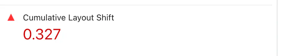
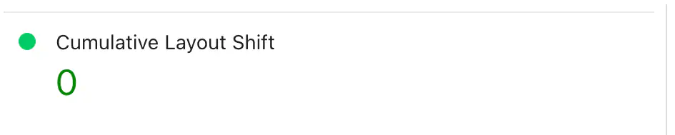
Because of something called cumulative layout shift, or CLS for short.
If you don’t specify dimensions on your images, the browser has no way of knowing how much space to allocate for them as it starts rendering the page. The browser can’t guess, so every image that it doesn’t know the size of, it has to assume is 0 pixels tall as it starts rendering. As each image then is inserted into the page after being downloaded, the layout of the page has to be adjusted to fit the real size of the image. Each time this happens, it causes other elements to jump around on the page.
Each of these jumps is called a layout shift, and the CLS is the cumulative, or total, of all of them.
So make sure to set the width and height of all images in the HTML. This will lower your CLS to zero or near zero, which is what you need for that perfect score, but more importantly also for a perfect user experience.
Level 2: Lazy Load
We have now reached level 2.
If all you do is use AVIF and MP4, and set image sizes, that’s already good. If you have a simple page, it might even be enough to nail a perfect score.
But if not, let’s take it up one level.
Lazy Load Image to Cut Initial Download Size
The first step in level 2 will be lazy loading.
Marking an image as lazy loading will make the browser defer downloading until necessary. Doing it is easy, just set loading="lazy" on the image element:
<img src="hege.avif" alt="Hege" width="1000" height="728" loading="lazy">
With lazy loading set, if the image is far down the page, the browser will now wait to download it until the user starts scrolling down closer to the image. This means that it won’t hog up bandwidth when initially loading the page, making it load faster.
And that’s it. That’s how easy it is to lazy load images. But if you have many images, it makes a big difference. We could not have reached a perfect score without lazy loading.
Bonus: Lazy Load Videos
In the section above, about replacing GIFs with MP4s, we mentioned the one drawback of doing that: GIFs can be lazily loaded, but MP4s can’t.
At least not natively.
While testing things out, we developed a solution for lazy loading videos based on this article. In the end we didn’t use it, but it worked well and it’s a good technique when needed, so we’ll share it here anyway. It works by using JavaScript to dynamically replace placeholder images with video elements, as the user scrolls near them.
Here is how it works:
In the HTML, use a regular img element for the placeholder image, and tag it as a lazily loaded video with the lazy-video class. Define the source of the video to load in the data-src attribute:
 <img width="720" height="720" loading="lazy"
  class="lazy-video"
  src="placeholder.avif"
  data-src="video.mp4">
Then replace these images with videos when the user scrolls near them, using the Intersection Observer API:
document.addEventListener('DOMContentLoaded', function () {
  // Lazy-loads videos by replacing image placeholders with video elements
  // See: https://imagekit.io/blog/lazy-loading-html-videos/

  if ("IntersectionObserver" in window) {
    var img_els = document.querySelectorAll('.lazy-video');

    var opts = {
      rootMargin: "0px",
      // Trigger when target is 50% visible (change as desired)
      threshold: 0.5,
    }

    // Set up observer that will trigger the load
    var obs = new IntersectionObserver(function (entries) {
      for (el of entries) {
        if (el.isIntersecting) {
          var img_el = el.target;

          // Create video element
          const video_el = document.createElement('video');
          video_el.controls = false;
          video_el.autoplay = true;
          video_el.muted = true;
          video_el.loop = true;
          video_el.playsInline = true;
          video_el.width = img_el.getAttribute('width');
          video_el.height = img_el.getAttribute('height');
          video_el.poster = img_el.src;
          const src_el = document.createElement('source');
          src_el.src = img_el.dataset.src;
          video_el.appendChild(src_el);

          // When video is loaded, attach video element, remove image element
          video_el.onloadeddata = function (img_el, video_el) {
            return (ev) => {
              img_el.parentNode.insertBefore(video_el, img_el);
              img_el.remove();
            };
          }(img_el, video_el);

          video_el.load();

          // Work is done, no need to observe this any longer
          obs.unobserve(el.target);
        }
      }
    }, opts);

    // Initialize all observers
    for (v of img_els) {
      obs.observe(v);
    }
  }
});
That’s it. You now have lazily loaded videos.
Level 3: Go Responsive
And that was the last piece for level 2. Your images are now very fast. In fact, so fast that you might reach a perfect score.
But if not, or if you just want to eke out that extra bit of speed because you’re a perfectionist like us, welcome to level 3!
Use Responsive Images to Improve Download Time
The first thing to do next is to use responsive images. This feature in HTML lets you send different image sizes depending on the screen resolution of the user’s device. In other words, you can send lower resolution images to mobile phones, and save some bandwidth.
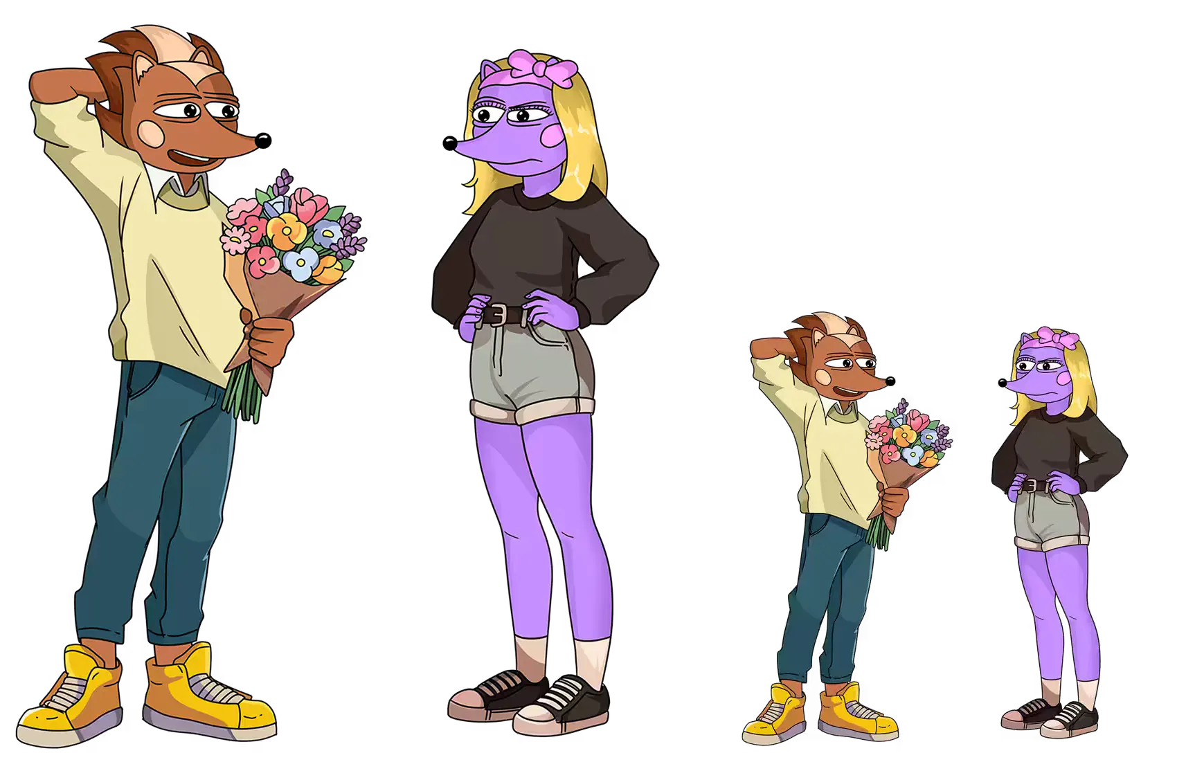
Here is an example from our website. This is the main image on the front page:
<img
  src="/r/76059421.avif"
  srcset="/r/886023564.avif 600w, /r/76059421.avif 1000w"
  sizes="(width >= 500px) 82vw, 500px"
  alt="Hege offering Hegena flowers"
  width="1000"
  height="1114"
  fetchpriority="high">
Using sizes and srcset lets you define multiple image sources (files). In the srcset, you put all the image sources. In this example, we have two images, one 600 pixels wide, and one 1000 pixels wide. In the sizes, you put a media query that the browser will use to determine what source to pick. In this case, we say that if the browser is wider than 500 pixels, pick the source that has a width of 82% of the window. Otherwise pick one that’s max 500 pixels wide.
This can be a little tricky to get right, and we don’t have space here to go through all the details. See for example this article for more on the topic. Also be aware that pixel density plays a role in what source the browser picks. So if you have a mobile phone with a high DPI screen, it might pick sources larger than you would expect.
Getting this right is definitely worth the effort though. The full sized image in the example is 56 kB for the desktop version, but the reduced size for mobile is just 27 kB. Saving 29 kB might not seem that much, but on a slow mobile connection that’s around 140 milliseconds saved. Multiply that by a couple of images, and it adds up.
Set Fetch Priorities to Optimize Loading Order
In the example above, you might have noticed the fetchpriority="high" attribute. By setting fetch priorities, you can give a hint to the browser about what it should prioritize.
Browsers are pretty good at guessing this, so it’s not always necessary. Use the developer console to see in what order images are loaded on your page. If you need to adjust the order, set fetchpriority="high" on the images you want to load sooner, and fetchpriority="low" on the ones that can wait.
Read more in the documentation.
Optimize SVGs to Save a Few Extra Kilobytes
Now we’re getting really down into the weeds.
If you have SVG images on your site, you can optimize them. However, SVGs are usually light-weight already, so the gains to be made here are not going to be huge.
If you still want to do it, first use an automatic optimizer to clean up the SVG code, and optionally reduce precision. There are various online tools for this. We used SVG Optimizer and it worked well.
How much can you save here? It depends on the image. As an example, we shrank the HEGE logo from 16 kB down to 8 kB. Those 8 kB are not going to matter in most cases, but on slow mobile data it’s around 40 milliseconds saved.
After this, if you really are a perfectionist and want to save a few kilobytes more, go in and hand-edit the SVG files to clean up the code. Often there are a few unnecessary attributes and styles that can be removed.
Understand that this it not going to make any difference whatsoever in practice (cleaning every one of our SVGs saved about 4 kB i total). But it will give you that warm fuzzy feeling of a job well done.
Example before cleanup:
<?xml version="1.0" encoding="UTF-8"?>
<svg id="Layer_1" data-name="Layer 1" xmlns="http://www.w3.org/2000/svg" viewBox="0 0 68.82 51.95">
  <defs>
    <style>
      .cls-1 {
        fill: #1d1d1d;
      }
    </style>
  </defs>
  <path class="cls-1" d="..."/>
</svg>
After cleanup:
<svg xmlns="http://www.w3.org/2000/svg" viewBox="0 0 68.82 51.95">
  <path d="..." />
</svg>
SVGs Can Also Be Inlined, But It’s Probably Not Worth It
Finally, let’s just note that SVGs can be inlined straight into the HTML. This saves a whole TCP roundtrip, at the expense of larger HTML and no caching. We tried it, but in our case, it just wasn’t worth the tradeoff. It can be handy in certain situations though, so here’s how to do it if you want to give it a try.
Going from an external SVG image:
<button class="next">
  <img width="16" height="16" src="chevron.svg" loading="lazy">
</button>
To inlining it (note that you don’t need the xmlns attribute on the svg when inlining):
<button class="next">
  <svg width="16" height="16" viewBox="0 0 16 16">
    <path d="M4.646 1.646a.5.5 0 0 1 .708 0l6 6a.5.5 0 0 1 0 .708l-6 6a.5.5 0 0 1-.708-.708L10.293 8 4.646 2.354a.5.5 0 0 1 0-.708" />
  </svg>
</button>
Conclusion: Images Matter
And with that deep dive into SVGs, we’ve now covered everything you need to know to optimize images for perfect performance.
To recap, this is what will give you the largest gains:
- Use AVIF and MP4.
- Set widths and heights.
- Lazy load.
That might be enough already for PageSpeed perfection. But if not, then:
- Use responsive images.
- Set fetch priorities.
And finally, if you want to geek out completely (we won’t judge!):
- Optimize SVGs.
Next Step: Optimize HTML & JavaScript
Phew. That was a lot. Thanks for staying with us this far!
You’ve now learned how to optimize both fonts and images. That’s two huge pieces that you’ve got to get right to make a website fast. But. That’s not enough.
Another crucial part of the puzzle is optimizing HTML and JavaScript.
But that’s for next week, when we’ll take a look at how to write lean semantic HTML, replace JavaScript with modern HTML, and dig really deep into how to optimize fingerprinting to shave that last little piece off the page weight.
Until then, have a great week, and make sure to jump into our Telegram and say hi to all the Hegends in there. Good vibes guaranteed!
– Team Hege 👊
PS. Check out the piece “EARTHSHAPER” below. This LEGENDARY collectible is up for sale on DRiP!